Andhra Pradesh BIEAP AP Inter 1st Year English Study Material Communication Skills Information Transfer Questions and Answers.
AP Inter 1st Year English Communication Skills Information Transfer
Verbal to Visual and Visual to Verbal
Information can be presented in different ways depending on the demand of the situation. Information Transfer is an important writing skill. It is often used to convert the information from verbal to visual and visual to verbal. Any report can be made interesting with a couple of illustrations. Visual information conveys the ideas in forms that can be seen and the reader can easily draw comparisons and contrasts and evaluate the situation depicted in it. There are many sorts of visuals, i.e. in the form of pictures, signs/symbols (signboards on roads). In a formal situation the information can be transferred into tables, line graphs, bar diagrams, pie diagrams, flow charts, tree diagrams and pictures.
Converting data into diagrammatic representation requires a different set of skills. Depending upon the type of data, information can be transferred with an appropriate graphic representation.
Advantages of information transfer :
- Large data can be grasped at a glance.
- More accuracy of data is possible.
- IT stimulates quick analytical approach to huge texts.
Look at the diagram given below. It is called a pie-chart because it looks like a pie/cake. The pie chart is used to show the break-up of one continuous variable into its component parts, it is divided into slices/sectors to illustrate numerical proportion or percentage of the total. The pie chart is divided into 100 percentage parts. The number of percentage parts required for each item are allocated proportionately. Each sector is represented by a particular colour to show a particular item. The title of the pie chart tells the reader what the chart is about.
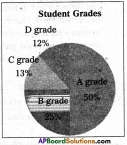
Let us try to understand the pie-chart.
First read the title of the pie-chart. Then count the number of sectors. Observe each sector and what it represents.
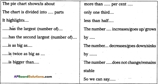
A grade : 50%
B grade : 25%
C grade : 13%
D grade : 12%
![]()
Interpreting the pie-chart
The pie-chart shows grades of students in a class. It is divided into four sectors. Each sector represents proportion of a particular grade in relation to the total number of students in the class. As we can see in the pie-chart, students of A grade occupy the largest space, half of the circle. B grade students occupy the second largest space covering 25% of the circle. Almost an equal number of students occupy C and D grades with 13% and 12% respectively of total strength of the class.
Look at the following pie-chart and try to interpret.
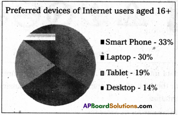
The pie-chart shows the results of a survey in which people aged sixteen and above participated. They were asked about the preferred devices for accessing internet. Participants mentioned four main devices – smart phone, laptop, tablet and desktop computer. The majority of the participants prefer to use smart phones and laptops with just three percent difference between the two. Nearly a third of participants prefer to go online with smart phones. Nineteen percent of participants use tablet. A desktop computer accounts for fourteen percent of user’s preferred device. Only a small minority prefer a device among these main four. The survey reveals the fact that many participants are accessing the internet outside their homes as smart phones and laptops are portable devices.
Drawing a pie chart
Imagine you survey your friends to find the kind of movie they like best:

You can show the data by the Pie Chart:
How to make them yourself
Now divide each value by the total and multiply by 100 to get a percent:
Now to figure out how many degrees for each “pie slice/sector”. A full circle has 360 degrees, so we do this calculation :
Now you are ready to start drawing ! Draw a circle.
Then use your protractor to measure the degrees of each sector.
Here you can see the first sector. Finish up by coloring each sector and
Give it a label like Comedy: 4(20%), etc., Do not forget to give a title.
Let us do it
A pie chart is constructed by converting the share of each component into a percentage of 360 degrees. In Figure 4, music preferences in 16 to 19-year-old young adults are clearly shown.
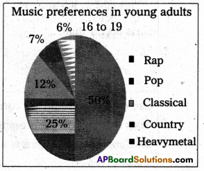
The pie chart quickly tells you that
- half of students like rap best (50%), and
- the remaining students prefer Pop (25%), Classical (12%), country (7%) and Heavy Metal (6%)
When drawing a circle graph/pie chart, ensure that the segments are ordered by size (largest to smallest) and in a clockwise direction.
In order to reproduce the pie chart, follow this step-by-step approach :
If 50% of the students liked rap, then 50% of the whole circle graph/pie chart (360 degrees) would equal 180 degrees.
- Draw a circle with your protractor.
- Starting from the 12 o’clock position on the circle, measure an angle of 180 degrees with your protractor. The rap component should make up half of your circle. Mark this radius off with your ruler.
- Repeat the process for each remaining music category, drawing in the radius according to its percentage of 360 degrees. The final category need not be measured as its radius is already in position.
- Labeling the segments with percentage values often makes it easier to tell quickly which segment is bigger. Whenever possible, the percentage and the category label should be indicated beside their corresponding segments. This way, users do not have to constantly look back at the legend in order to identify what category each colour represents.
Use of Tense : Mind the correct use of tenses when describing a chart. If the chart deals with facts in the present, use the Simple Present, the facts are the past, then use the Simple Past. If there is a connection between the past and the present, use the Present Perfect
Exercise
Question 1.
Prasad’s family expenses are ten thousand rupees a month. He made a pie-chart on their expenses for food, housing, savings, clothing, entertainment and miscellaneous expenses. Read the pie-chart and convert it into a paragraph.
Monthly expenditure of Prasad’s family
Housing -25%
Entertainment -12%
Savings – 10%
Food -30%
Clothing -12%
Miscellaneous -11%
Answer:
This is a pie chart showing the expenditure of Prasad’s family expenses. They spend 25% of the income which comes to ₹ 2500/- for housing, 30% of the income (i.e) ₹ 3000/- for food, 12% (ie) ₹ 1200/- for entertainment and another 12% (i.e) ₹ 1200/- for clothing. He saves 10% of his income which comes to 1000/- and the remaining 11% of his income which comes to ₹ 1000/ – and the remaining 11% of the income which comes to ₹ 1100/- is spent on miscellaneous expenditure. It is the planned expenditure of Prasad’s income.
![]()
Question 2.
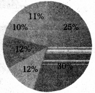
Read the pie-chart of balanced diet and convert it into a paragraph.
Answer:
This pie chart shows the balanced diet particulars. There are different food items with their value of proteins in percentage. A person has to select the food items and make them equivalent to 100 percent. Fruits and vegetables have the balance of 25% and 11%. Bread, rice and other starely material shares 35% to 39%. Meat fish, eggs non-dairy source of protein come under the range from 10% and milk and dairy foods get 15%. Thus one has to select the food stuff and make a complete balanced diet.
Question 3.
Read the pie-chart and convert it into a paragraph.
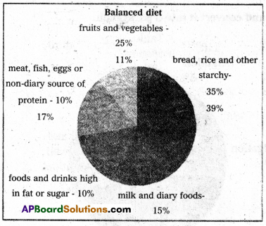
Answer:
This is the pie-chart of the income source to Government of India. The percentage by each head is given in five heads. Whole of the income is divided according to percentage. The highest income source is state own Tax revenue which comes to 43% and the second in category of income source is from borrowing and other liabilities which comes to 24%. Next comes the state own non-Tax Revenue which is 14%. Share in central Taxes is 13% and grants in Aid in centre comes to 6% of the total. Thus the figure shows the union budget of 2018-19.
Question 4.
Read the pie-chart and convert it into a paragraph.
Answer:
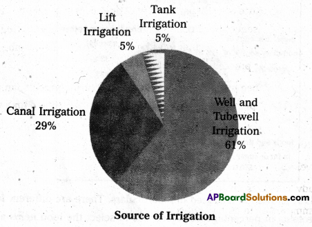
Here is a pie-chart showing the sources for irrigation. Major share of irrigation is by Well and Tubewell irrigation which is 61% of the total. Canal irrigation is of 29% of the total and it comes to second place. Lift Irrigation and Tank Irrigation share equal parts each having 5%. Thus different sources have different shares.
Flow Chart
A flow chart is a graphical or symbolic representation of a process. Each step in the process is represented by a different symbol and contains a short description of the process step. The flow chart symbols are linked together with arrows showing the process flow direction.
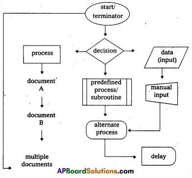
Commonly used symbols in Flowcharts
A flowchart is a picture of the separate steps of a process in sequential order. Elements that may be included are : sequence of actions, materials or services entering or leaving the process (inputs and outputs), decisions that must be made, people who become involved, time involved at each step and/or process measurements.
The process described can be anything : a manufacturing process, an administrative or service process, a project plan. This is a generic tool that can be adapted for a wide variety of purposes.
We use a Flowchart
- To develop understanding of how a process is done.
- To study a process for improvement.
- To communicate to others how a process is done.
- When better communication is needed between people involved with the same process.
- To document a process.
- When a planning a project.
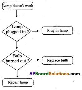
Look at the following flowchart and study the steps involved in the process.
The flowchart represents the process for dealing with a non-functioning of an electric lamp. When you find the lamp does not work, first check whether the lamp is plugged in. If it is unplugged, plug in the lamp and just switch the power on. If the bulb is found burned out, turn off the power and replace the bulb with new one or else repair the lamp connecting wires in right order.
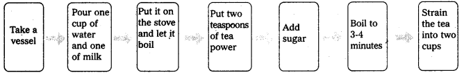
Process of preparing two cups of Tea
Take a vessel. Pour one cup of water and one cup of milk. Put it on the stove and let it boil. Put 2 teaspoons of tea powder. Add sugar. Boil it for 3-4 minutes. Strain the tea into two cups. The tea is ready. Show the given process in the form linear flow chart.
Exercise
Question 1.
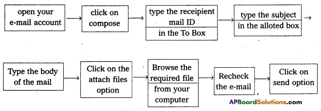
How to send an email with an attachment. Open your email account. Click on ‘compose’. Type the recipient’s mail ID in the To’ box. Type the subject in the allotted box. Type the body of the email. Click on the ‘Attach files’ option. Browse the required file from your computer. Re-check the mail once again; Click on ‘Send’ option. Show the given process in a flow chart.
Answer:
Flowcharts
Exercise -1. Process of sending e-mail.
![]()
Question 2.
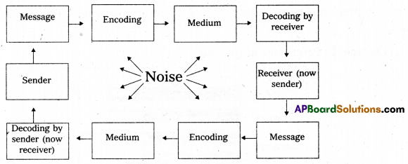
Read the following flowchart and describe the process of communication.
Communication Process Transmission phase
Answer:
This is a flow chart showing the process of communication. There is noise being transmitted. Start with a message. It was sent by the sender. It was coded and the medium was ready. There is the receiver decoding. The receiver becomes the sender now. Again message, coded and the medium is ready decoded by the sender who has become the receiver. Thus communication is transmission.
Feedback phase
Bar graphs
A bar chart or bar graph is a chart or graph that presents categorical data with rectangular bars with heights or lengths proportional to the values that they represent. The bars can be plotted vertically or horizontally. Bar graphs are an extremely effective visual to use in presentations and reports. They are popular because they allow the reader to recognize patterns or trends far more easily than looking at a table of numerical data.
The most common type of bar graph is the vertical bar graph. It is very useful when presenting a series of data over time. The vertical bar chart below shows a series of quarterly data, categorized by year. The reader can easily see not only the trends of sales over the four- year period, but also how the sales compare during each quarter.
Data Comparison Bar Chart
Horizontal Bar Graph
One disadvantage of vertical bar graph is that they don’t leave much room at the bottom of the chart if long labels are required. Converting the vertical data to a horizontal bar chart solves this problem. There is plenty of room for the long label along the vertical axis, as shown below:
Example 1:
Percentage of students
Example 2:
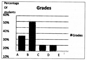
Grade on Half-Yearly Examination
The illustration is a vertical bar graph depicting the results of a test given to a hypothetical class of students. Each letter grade (A through E) is denoted by a vertical bar of a certain height on the X axis. The Y axis shows percentage of students. The total of the percentages is equal to 100. The percentage of students receiving a specific grade is directly proportional to the height of the bar representing that grade.
As can be seen in the pie chart, half of the students got B grade. It is followed by A grade. One fourth of the students in the class attained A grade. Almost an equal number of students, i.e., 13% and 12% of the class were assessed with C and D grades respectively. Only 2% of the students, the least in the class were given E grade.
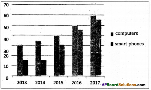
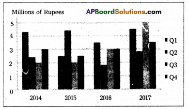
The chart gives the information about how much money was spent on computers and smart phones in a country between the years 2013 and 2017. According to the chart, there were upward trends in spending on both items. Computer sales increased by 5 million dollars each year. Smart phone sales remained level at 15 million dollars until 2014 and then increased dramatically, reaching 55 million dollars in 2017. People’s total expenditure on these electronic devices rose dramatically in this period.
Example 3 :
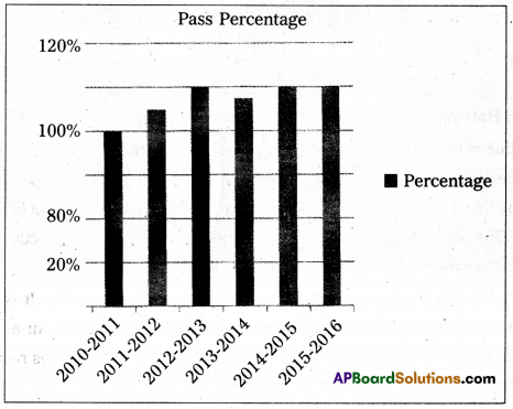
In the year 2010-11, the result of a college is 80%. 2011-12 is 90%. 2012-13 is 100%, 2013-14 is 95%, 2014-15 is 100% and 2015-16 is 100%. Show the given data in the form of a line graph.
Exercise
Question 1.
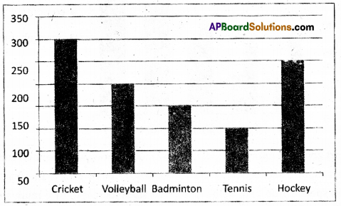
Examine the bar graph representing the number of students, interested in different games, in a school and try to interpret it into a paragraph.
Answer:
It is a bar-graph representing the number of students interested in games. There are five games and the number of students interested in different games is shown. 300 students like the game of cricket. It is the hight number in the whole of the school. Tennis was liked by the least number 100. The second highest number was in favour of Hockey which comes to 250. 150 students liked Badminton and for volleyball it comes to 200.
Question 2.
Read the following bar chart and interpret it in a paragraph.
Answer:
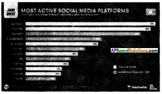
This is the bar graph of some of the most active social media platforms available. Of the platforms Facebook occupies the highest popularity with 72% of the available data. The least is skype with 17%. There are 7 types of net works in the graph 5 types belong to messenger chat. app. U tube comes next Wattsapp is the third one with 64%. FB messenger shares 42%, Instagram with 40%, We chat is with 33 and Google has got its share of 29% . Line is 25% Twitter is 24% and Sina Weibo and Linkedin share equally and it is 20% each. Thus the most active social media platforms are illustrated here.
![]()
Question 3.
Read the following bar chart and interpret it in a paragrpah.
Answer:
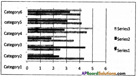
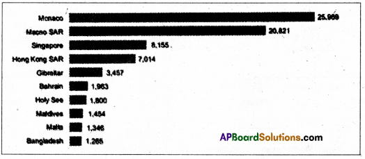
This is a bar chart showing densly populated countries and territories. The population density is calculated per square K.M.
In the year 2017 Monaco has got 25969 the highest density and the lowest density was Bangladesh which has 1265 per sq.K.M. Second in density is Macao Bar with 20821. Next comes Singapore with 8156. Hongkong is there with 7014. Gibraltar is there with 3457. The other four countries have almost equal with lessthan 2000 density per square K.M.
Tree Diagrams!
Tree Diagrams are often used :
- To show family relations and descent.
- In taxonomy, the practice and science of classification.
- In evolutionary science, to show the origin of species.
- In computer science and mathematics.
- In businesses and organisations for managerial purposes.
A Tree Diagram is a way of visually representing hierarchy in a tree-like structure. A Tree Diagram consists of branches that represent the relationships and connections between the members. Each branch in a tree diagram represents a possible outcome.
Tree Diagrams are often used :
- In evolutionary science, to show the origin of species.
- In computer science and mathematics.
- In businesses and organisations for managerial purposes.
Look at the following tree diagram which shows various kinds of musical instruments.
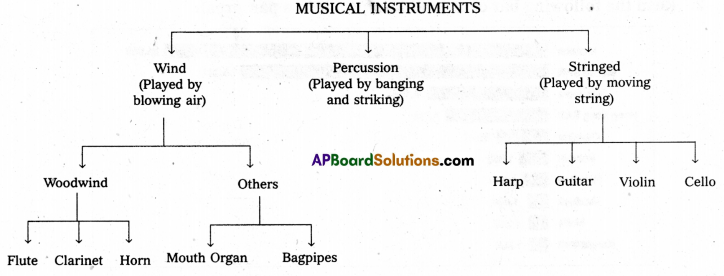
The tree diagram shows different kinds of musical instruments. They are divided into three main classes according to the way that they are played. Some instruments are played by blowing air into them. These are called wind instruments. Some of these are said to be of the woodwind family. Examples of woodwind instruments are the flute, the clarinet and the horn. There are also various other wind instruments such as the mouth-organ and the bagpipes. Some instruments are played by banging or striking them. Instruments like this are called percussion instruments. The last big group of musical instruments have strings. There are two kinds of stringed instruments. Examples are the harp and the guitar, the violin and the cello.
Exercise
Question 1.
Read the following tree-diagram and convert it into a paragraph.
Answer:
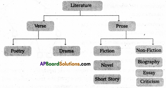
It is a tree diagram showing the tree of literature. Literature can be divided into two heads,
- Verse,
- Prose.
Verse again divided into two parts.
- Poetry
- Drama.
Pertaining to Prose it is divided into two
- Fiction
- Non-Fiction.
Novel, short story come under Fiction and Biography, Essay and Criticism come under now Fiction Prose.
Question 2.
Read the following tree-diagram and convert it into a paragraph.
Answer:
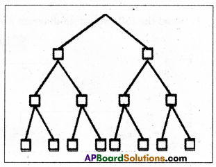
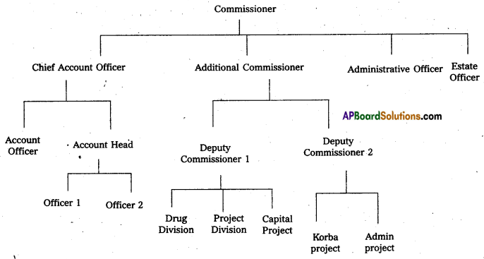
It is the tree diagram of the positions of officials in an office.
Commissioner is the head of all. There are four different officers under him, Chief Accounts Officer, Additional Commissioner, Administrative Officer and State Officer. Next to the CAO, comes two officials Accounts Officer and Accounts head. The Accounts Head has two officers, officer 1 and Officer 2.
There are two Deputy Commissioners under the Additional Commissioner. Next to the Deputy Commissioner I, there are three divisions
- Drug Division,
- Project Division
- Capital Project division.
Under the Deputy Commissioner 2 there are two projects Korba project and Admin project. Administrative Officers and the Estate officer work direct under the Commissioner.
![]()
Question 3.
Read the following bar chart and interpret it in a paragrpah.
Answer:
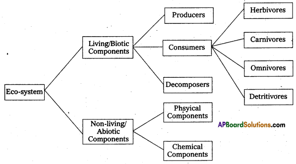
Eco-system can be divided into two parts
- Living Biotic components and
- Non-living abiotic components.
In the living components there are three divisions Producers, Consumers and Decomposers. In Non-Living again there are two types of components Physical components and Chemical components. In the consumers we have the Herbivores, Carnivores, Omnivores and Detritivores.
Tables
A table is a set of data arranged in rows and columns and is one of the most common ways of putting information across to people. Tables are widely used in communication, research, and data analysis. Tables appear in print media, handwritten notes, computer software, architectural ornamentation, traffic signs, and many other places.
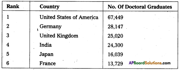
Read the following information given in the table : The Countries with the most Doctoral Graduates
Try to understand the data provided carefully, before jumping to answer the following questions.
- What is the table about ?
- Which is the country produced highest number of doctorates ?
- What is the place of India ?
- Which country has at least twice as many Ph.D graduates as Germany produced ?
You can start interpreting the table by answering the above questions.
Interpretation
The table gives the information of the countries with the most doctoral graduates. According to the OCED report, The United States of America beats the rest hands down. It has at least twice as many doctoral graduates as Germany produced in the year 2014.67,449 scholars were graduated with a Ph.D in the U S. while compared with 28,147 in Germany. It is followed by the UK with 25,020 Ph. D. Graduates. India occupies fourth place with 24,300 doctoral degrees. Fifth and sixth ranks stand the countries Japan and France with 16,03j9 and 13,729 Ph.Ds respectively.
Example
Impact of Mother’s education on their children’s educational score
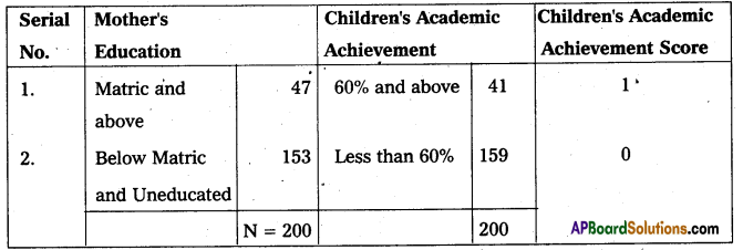
The table shows the impact of mother’s education on their children’s educational score. As shown in the table, when mothers are educated at Matric level and above, their children’s educational score is one. Similarly mothers who are uneducated and their educational level is below Matric, their children’s educational score is 0. It reveals the fact that the children of educated mothers achieved 60% and above marks in their final examination. Children whose mothers are educated below Matric level or uneducated secured only less than 60% of marks.
Exercise
Question 1.
Read the following table and interpret it in a paragraph.
Trend in Average Annual Drop-Out Rate at different stages of School Education
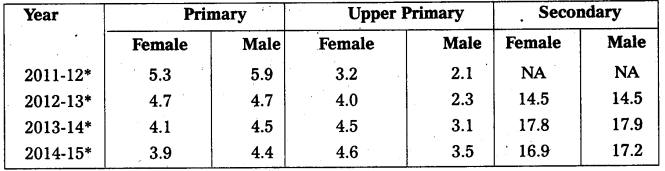
Source : Census of India, Office of the Registrar General, India.
Answer:
It is a table showing the average annual dropout rate at different stages of school education.
Primary, supper primary and Secondary Schools and the dropout rate of these different schools during the four years be given. In the year 2011-12 in the Primary Section there was a dropout rate of 5.3 in girls and 5.9 in boys. In the same year in the upper primary level dropout rate was 3.2 in girls and 2.1 in boys. Similarly when the secondary level was observed in the same year there were no dropouts available. Of the four years the number of female dropouts in 2014 -15 was very with 3.9 and the male drops were low in the same year (ie) 2014-15. In the upper Primary section the lower number of female students was seen in the year 2011-12 and the male student dropouts were low in 2011-12 only arid at the Secondary level the lowest female dropout occured in 2012-13 and the lowest male dropouts also happened in 2012-13 only. Thus it is the history of dropouts during the four years.
![]()
Question 2.
Read the following table and interpret it in a paragraph.
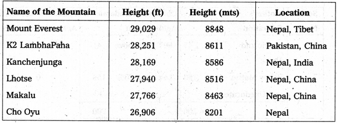
List of the highest Mountains in the World
Route Map
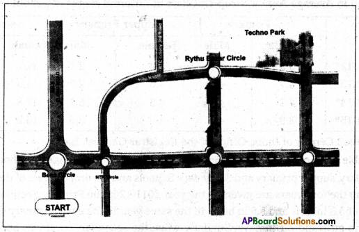
Your friend is attending an interview at Techno Park, Vijayawada. Give directions to him verbally or send him a route duly indicating the land marks and arrow marks till the venue.
On alighting the bus, move a few steps towards Benz circle and turn right. Go along the Bandar Road ignoring the crossroads at NTR Circle till you reach the next cross roads. Turn left at the cross roads and follow the High School road to find Rythu Bazar Circle. At the circle take the road on your right. Walk a few yards ahead to locate the Techno Park, facing Auto Nagar road.
Exercise
Question 1.
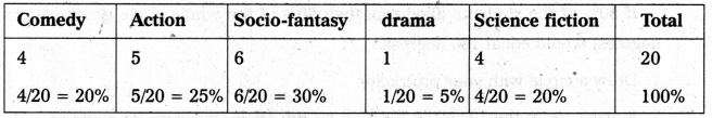
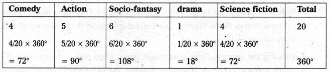
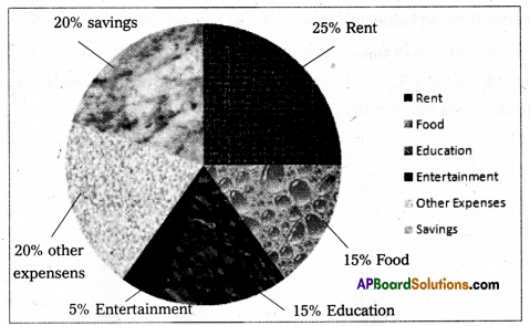
Mr. Gowtham’s monthly income Is 30,000. He spends 25% of his salary on rent and 15% on food. Another 15% is spent on the education of his children. He uses 5% of his income for entertainment. Household and other expenses consume 20% of his salary. The remaining 20% of his income is saved. Represent this data by a pie chart.
Answer:
Question 2.
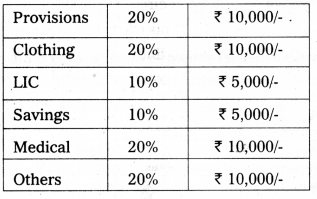
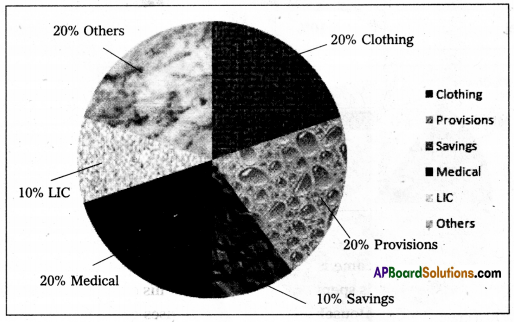
A person working in a software company earns ₹ 50,000/- per month. He spends the money as per the data given in the table below. Read and show it in a pie chart.
Expenditure statement
Answer:
Question 3.
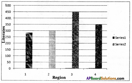
According to a survey, the literacy rate in a rural area is as follows : In region 1, the number of literates is 285. In region 2, the number of literates is 300. In region 3, the number of literates is 450. In region 4, the number of literates is 350. Show the given data in the form of a bar diagram.
Answer:
![]()
Question 4.
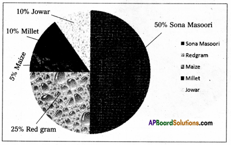
Here is a list of crops that grow in Kurnool district shown in the following table. Prepare a pie diagram of their production.
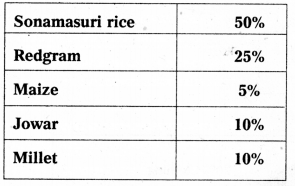
Answer:
Question 5.
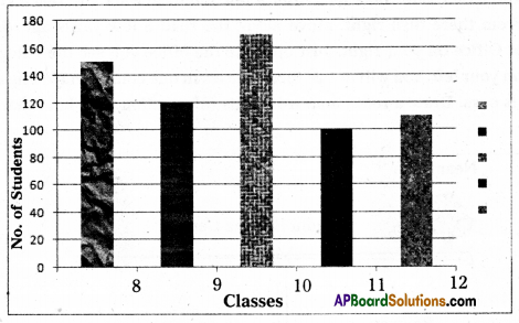
The number of students in five different classes is like this. 150 students in 8th class, 120 in 9th class, 170 in 10th class, 100 in 11th class and 110 in 12th class. Represent this data on the bar graph.
Answer:
Question 6.
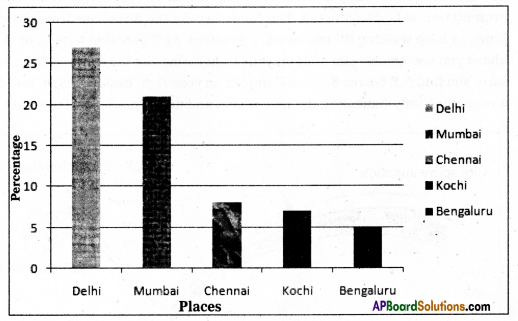
Five Indian cities are accounted for the most International passenger traffic airports. Delhi tops the position in this category with a share of 27 percent followed by Mumbai (21 percent), Chennai (8 percent share), Kochi (7 percent) and Bengaluru (5 percent share). Draw a bar graph depicting this information.
Answer:
Question 7.
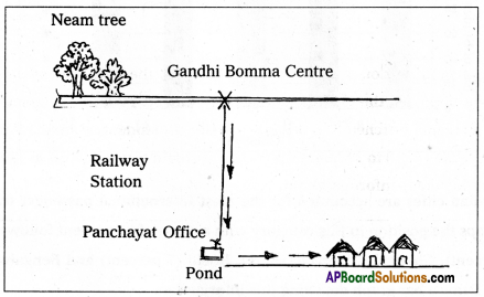
Responding to your invitation your city friend is coming to your village to spend a few days. You have sent him the following whatsapp message describing the directions. On reaching the exit gate at the railway station you see the main road with big neem trees on the either side. Take left. After a few minutes walk you reach Gandhibomma Centre. From there turn right. Move along the road a few yards ahead. You see the Panchayat Office on your right. Just opposite the office you see the village pond. Take the lane on your left. You will notice three houses in one compound facing the pond. The first one is ours. Draw a route map using this information with land marks and arrow marks.
Answer:
Question 8.
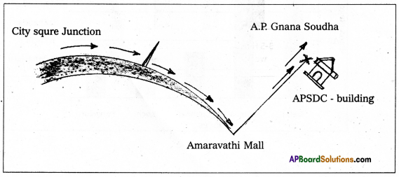
You are selected for the A.R State Pratibha Award. You are asked to attend the award presentation at Gnana Soudha. The following are the directions from the city square junction keep walking till you reach Y junction. At Y junction take right. A few yards ahead you see Amaravathi Mall on your right facing the Vidya Marg. Take Vidya Marg turn. You find A.P. Gnana Soudha Complex on your right beside APSDC building. Draw a route map duly indicating the land marks and arrow marks till the venue.
Answer:
Question 9.
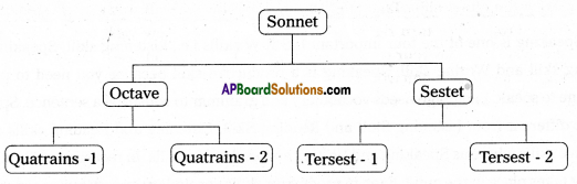
Sonnet is a poem of fourteen lines. First eight lines are called Octave. Next six lines are Sestet. Octave is again divided into two Quatrains Sestet is again divided into two Tersests. Show this information in a tree-diagram.
Answer:
Question 10.
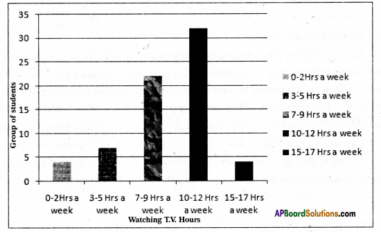
A survey conducted on a group of students about the time they spend on watching television disclosed the fact that 4 students watched TV 0 to 2 hours a week. All the same 7 students watched 3 to 5 hours a week; 22 students watched 7 to 9 hours; 32 students watched 10 to 12 hours a week and 4 students watched 15 to 17 hours a week. Convert the above information into a bar graph.
Answer: