Students can go through AP Board 8th Class Maths Notes Chapter 7 Frequency Distribution Tables and Graphs to understand and remember the concepts easily.
AP State Board Syllabus 8th Class Maths Notes Chapter 7 Frequency Distribution Tables and Graphs
→ The Central Tendencies are 3 types. They are
- Arithmetic Mean
- Median
- Mode
→ Information, available in the numerical form or verbal form or graphical form that helps in taking decisions or drawing conclusions is called Data.
→ Arithmetic mean of the ungrouped data = 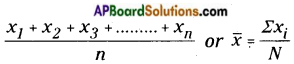 (short representation) where ∑xi represents the sum of all xis, where ‘i’ takes the values from 1 to n.
![]()
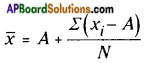
→ Arithmetic mean = Estimated mean + Average of deviations
→ Mean is used in the analysis of numerical data represented by unique value.
→ Median represents the middle value of the distribution arranged in order.
→ The median is used to analyse the numerical data, particularly useful when there are a few observations that are unlike mean, it is not affected by extreme values.
→ Mode is used to analyse both numerical and verbal data.
→ Mode is the most frequent observation of the given data. There may be more than one mode for the given data.
→ Representation of classified distinct observations of the data with frequencies is called ‘Frequency Distribution’ or ‘Distribution Table’.
→ Difference between upper and lower boundaries of a class is called length of the class denoted by ‘C’.
→ In a class the initial value and end value of each class is called the lower limit and upper limit respectively of that class.
![]()
→ The average of upper limit of a class and lower limit of successive class is called upper boundary of that class.
→ The average of the lower limit of a class and upper limit of preceding class is called the lower boundary of the class.
The progressive total of frequencies from the last class of the table to the lower boundary of particular class is called Greater than Cumulative Frequency (G.C.F).
→ The progressive total of frequencies from first class to the upper boundary of particular class is called Less than Cumulative Frequency (L.C.F.).
→ Histogram is a graphical representation of frequency distribution of exclusive class intervals. When the class intervals in a grouped frequency distribution are varying we need to construct rectangles in histogram on the basis of frequency density.
Frequency density = \(\frac{\text { Frequency of class }}{\text { Length of that class }}\) × Least class length in the data
→ Frequency polygon is a graphical representation of a frequency distribution (discrete/ continuous).
![]()
→ Infrequency polygon or frequency curve, class marks or mid values of the classes are taken on X-axis and the corresponding frequencies on the Y-axis.
→ Area of frequency polygon and histogram drawn for the same data are equal.
→ A graph representing the cumulative frequencies of a grouped frequency distribution against the corresponding lower/upper boundaries of respective class intervals is called Cumulative Frequency Curve or “Ogive Curve”.